Museum Plaza

Museum Plaza
Originally uploaded by shermans.
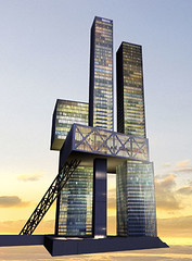
This is the rendering for Louisville's new landmark building that will hold a contemporary art museum, residential condominiums, commercial office space and the University of Louisville's Fine Arts Program. It is being designed by Office for Metropolitan Architecture, Rem Koolhaas's firm. Koolhaas is a huge name and a rather large plum for Louisville to get. Some of you Chicago types can see OMA's work in the recent Illinois Institute of Technology Campus Center.
I really like the idea the museum center. My praises to Steve Wilson and Laura Lee Brown, the lead developers, in investing a lot of money and energy into creating an architecturally explosive statement in the downtown area. And I also appreciate the desire to include residential units. Downtown Louisville seems to lag behind a lot of other urban areas when it comes to bringing back 24 hour residences. A lot of things are happening down there, but the successes will be short lived without people coming back to live downtown.
All that said, I don't like the building. It has some fundamental flaws in how it relates to the surrounding buildings, and the underlying assumptions about how people use buildings. Now to be fair, the site selected is a tricky spot. As I understand it, it's in a flood zone, it has to deal with a major expressway right next to it, it's got another major landmark building--the Muhammed Ali Center--competing with it for visual space. Such constraints can lead to creative, innovative solutions. They can just as easily lead to awkward, souless failures. I think the museum plaza skews toward the latter.
The most serious flaw is in elevating the main concourse--the museum plaza itself--into the air. Civic buildings like museums are focal points for a community. They should be monumental public spaces that remind us of what's noble and good about our humanity. (Yes, this is an old-fashioned humanist understanding of art, civics and design--sue me). Key to this existential experience is the transition from the commonplace, quotidian life into the realm of beauty, ideas and challenge of art.
Yet this transition, by way of extended elavator rides or funicular ride (that diagonal strut across the lower half), mutes the experience, isolating the public element of the building behind distancing technology. Literally, it puts art above the people instead of in contact with the people.
The secondary function of civic buildings is to create a focal point for the surrounding area. A place where spontaneous public interaction can occur. For example, look at the front of The Kentucky Center for the Performing Arts. The wide, accommadating stairs lead up to a monumental entrance way. People meet on the stairs before shows. Festivals use the stairs as a main staging area. One of my favorite concert moments was watching Buddy Guy play his guitar standing on the Jean Dubuffet statues looking at his reflection in the mirrored glass. The Museum Plaza has none of this. Rather, it sits at a remove, beyond an impassable gulf, admitting only the favored through sliding doors.
Ultimately, the building off gasses artistic arrogance. Rather than see the difficult site as a challange to create a civic space for the city, OMA saw it as a chance to subvert the idea of civic architecture in pursuit of innovation solely for the sake of innovation.
Watch the video. See the clever modeling bit where the sub-titles read "identify public elements, insert public elements at grade (street level, in other words)...flip...connect to context."
This is marketing bullshit to seduce us into thinking that their _radical_ design works in relation to the rest of the city. "connect to context" cannot be done by a lame diagonal escalator. The title cards should read: "identify public elements, completely destroy their function as public elements, create an isolated, elitest private sky box for people who like looking down on the peasants."
The developers have the right idea to integrate museums, commercial and residential aspects in one significant building. They just selected an architectural firm more enamoured of their daring and innovation instead of concerned with what's best for the city.


1 Comments:
I tend to agree with your comment, "innovation for innovation's sake". When I read the article describing the development procees it seemed to imply that they could find ways to build on that spot regardless.
When I first saw the building I liked its modern architecture. However when it is placed it the context of its surroundings it looks as if it is being built over the existing buildings rather than next to them.
Dad.
Post a Comment
<< Home